Vault
Vault.com Career Platform
Vault.com provides in-depth intelligence on what it’s really like to work within an industry, company, or profession—and how to position yourself to launch and build the career you want.
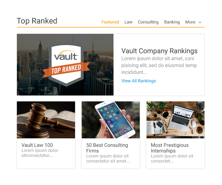
Vault is best known for its influential rankings, ratings, and reviews on thousands of top employers and hundreds of internship programs. The data used to compile these rankings and reviews are collected and verified through directed surveys of active employees and enrolled students. Vault also welcomes employees and students unable to participate in directed surveys to submit online reviews on their experiences, salaries, interviews, and more.
Tools
Sketch, Adobe CC, HTML, CSS, JavaScript, Brackets Text Editor, InVision/Craft, Notable, Basecamp, Slack, Skype, iPad GoodNotes 4.
Establish Objectives and a Starting Point
Clearly communicate product and service offerings.
Modernize and simplify the user experience.
Create brand consistency across entire site.
Increase membership accounts and newsletter subscriptions.
Improve SEO.
As Lead UI Designer for Vault.com, I began by meeting weekly with each department to establish our objectives and a starting point. With this feedback, I was able to design a simpler architecture and cleaner interface


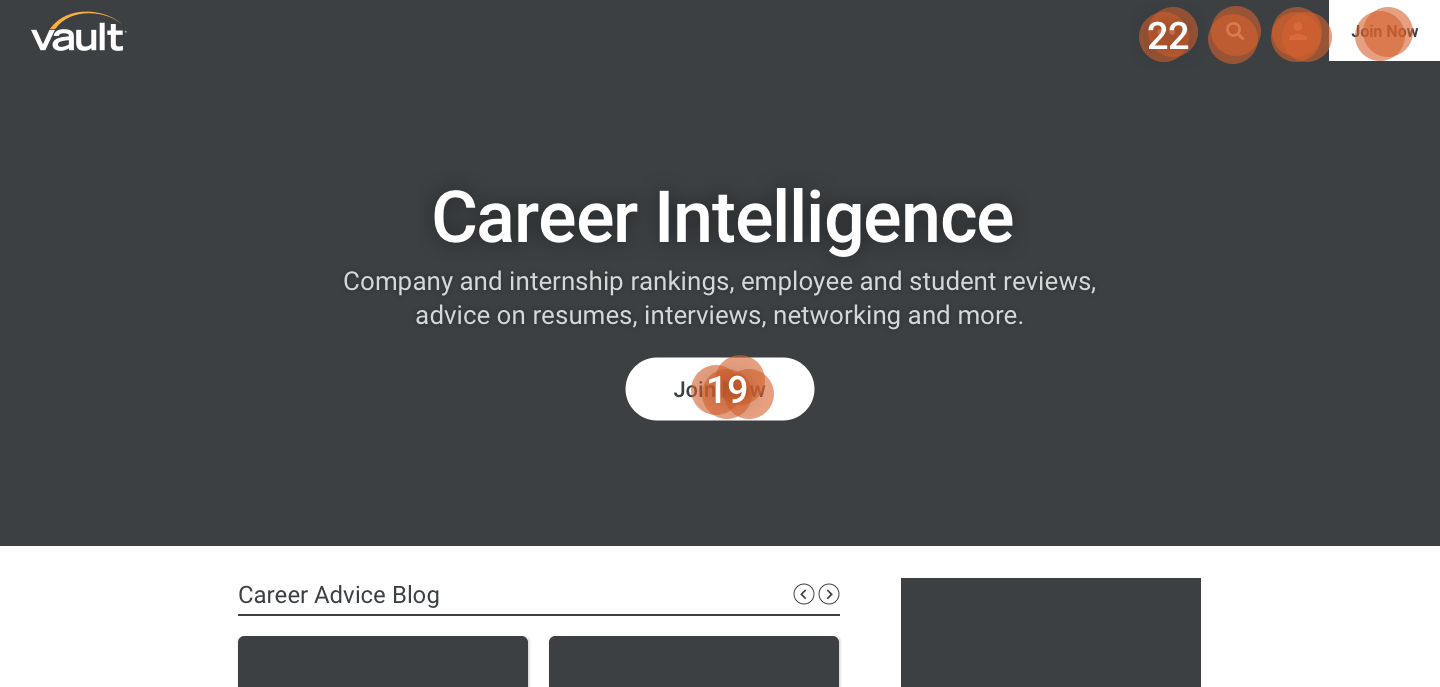
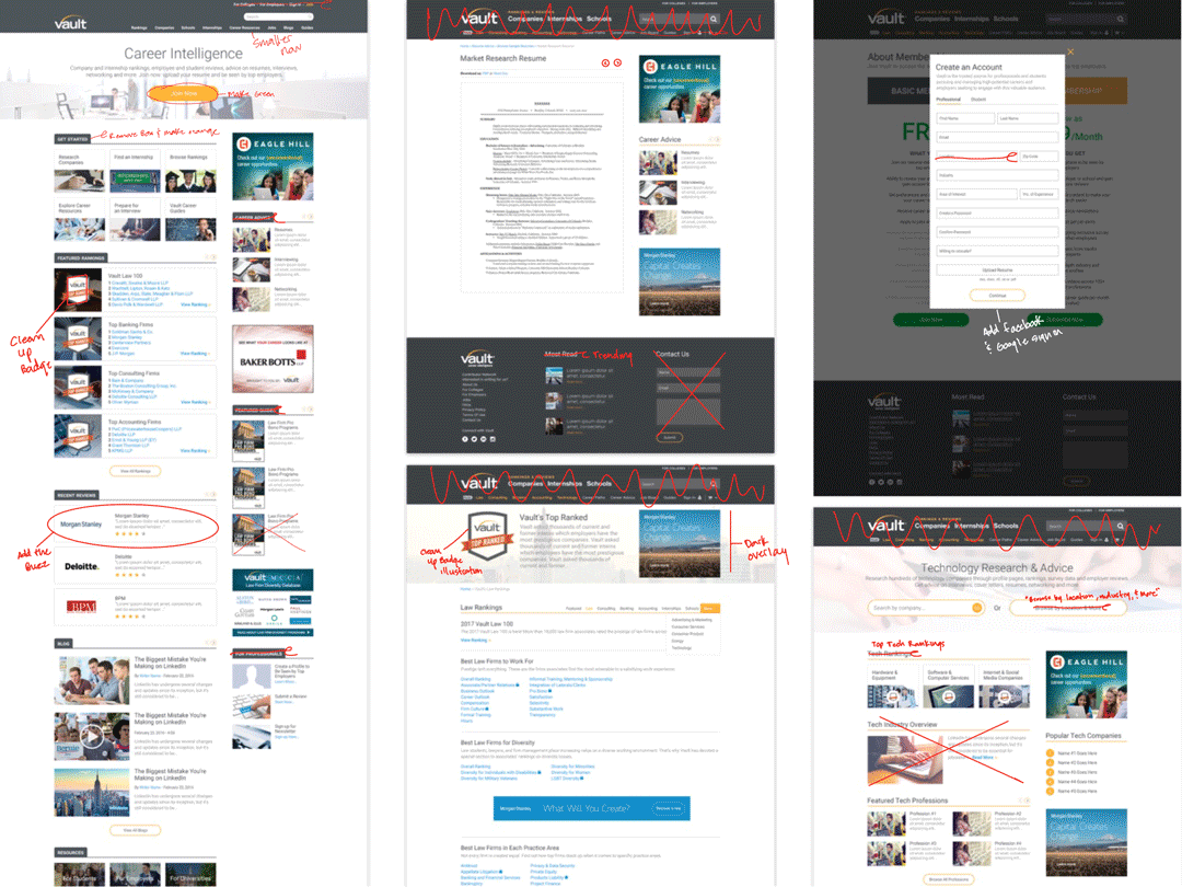
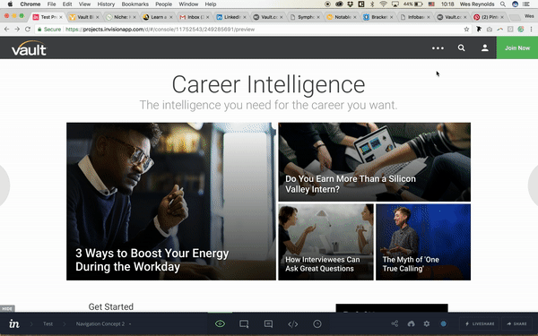
Visit vault.com to see the product before the redesign process.
First, I worked with UX, product and developer teams to map out all of the pages we could find. We looked for patterns in each page and established which areas of the site were controlled by which technologies. This enabled us to identify any redundant pages and duplicated content. Understanding the technical limitations and volume of content allowed the team to figure out what was possible during the redesign process.
Research Demographic and Identify User Personas
We used the research done previously to develop quick user personas and found the majority of the users on Vault had Law, Consulting, Banking and Accounting interests or backgrounds. The majority of our users were between the ages of 18 and 35 years old.
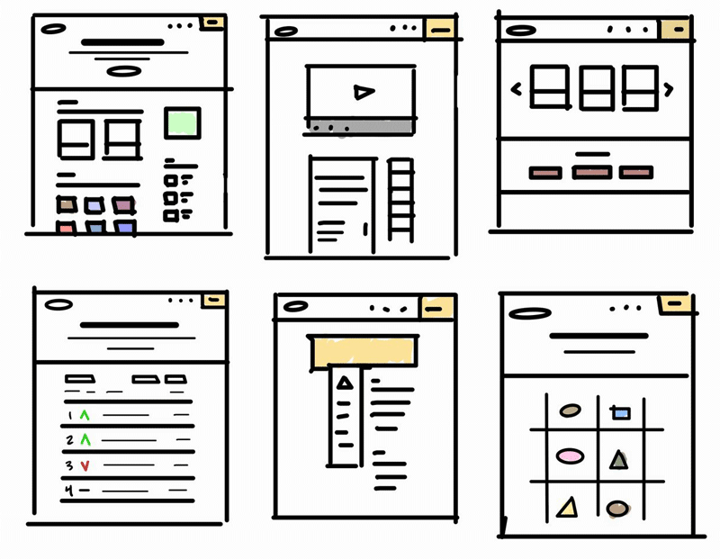
Sketch Layout Ideas
Rough sketches for our initial page layouts and prototype ideas before focusing on refined visual design.
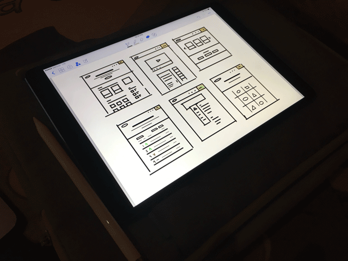
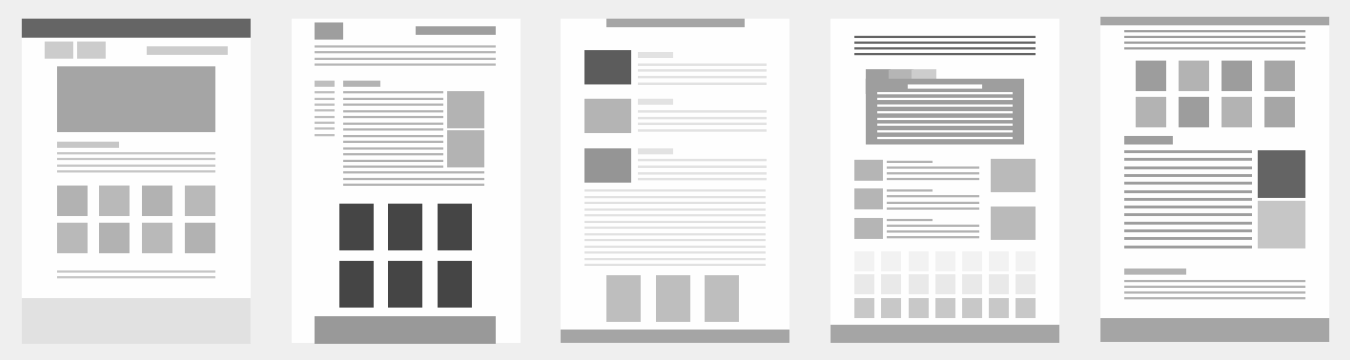
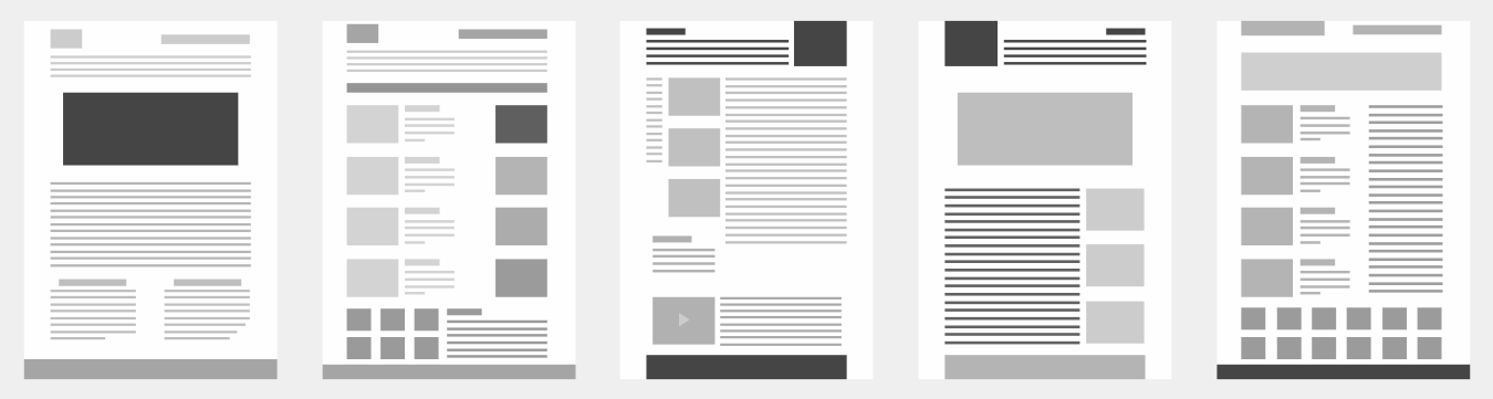
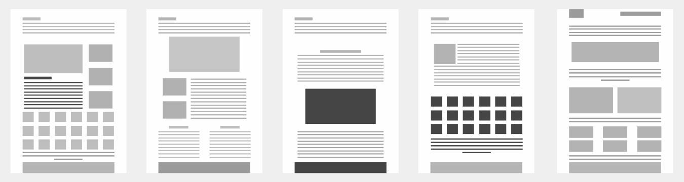
Develop Digital Wireframes
Using the architecture and feedback gathered during our research, I created a variety of digital wireframe layouts.
Create Lo-Fidelity Mocks & Test Them
Using Notable, we drafted a quick click test to see if our elements and flow made sense. Usability testing and validation were essential to the design process staying on track.
We asked each test user the following question...Where would you click to learn more about our products and resources?
Step Seven: Develop a Polished Design Aesthetic
I created mood boards for different pieces of design that I liked. From there I began to play and build different looks. Exploring different layouts and elements helped me gauge what fits with our content and brand.
As I collaborated with the team, I came up with what I wanted users to feel when they visit the site. I also wanted to match the style of the product so there wasn't a gap between expectation and reality. I researched sites in and out of the career advice industry to find what we wanted to do and what we didn't want to do.
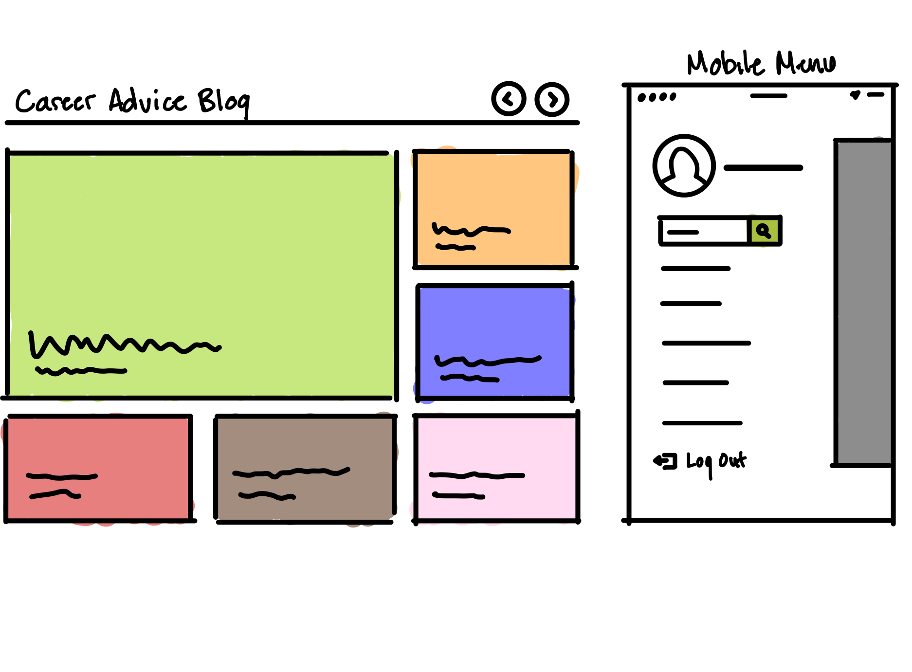
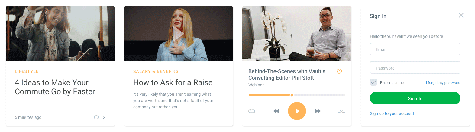
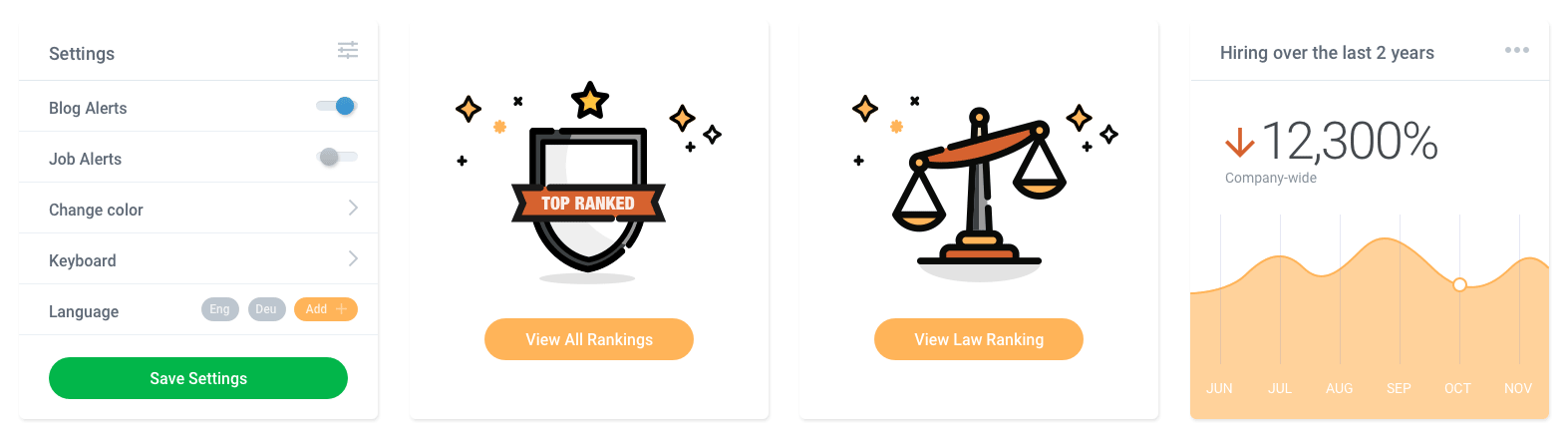
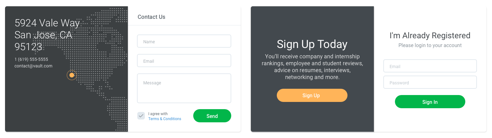
Header Designs:
UI Components & Elements:
Review Process
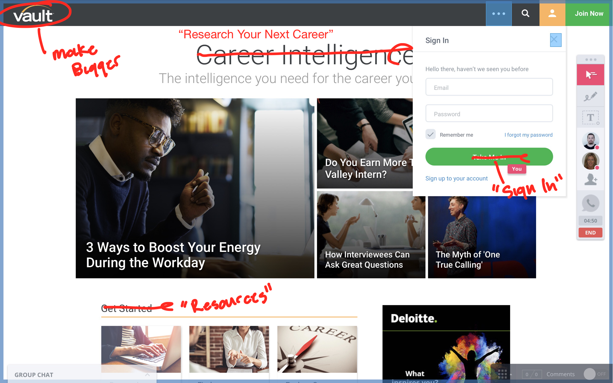
Each week, we reviewed mockups with team members to gather feedback.
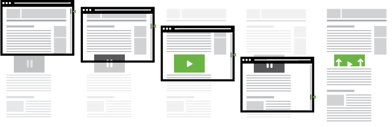
Create High Fidelity Prototypes & Animations
Click here to see more examples.
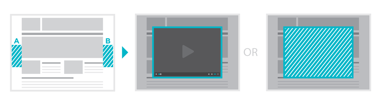
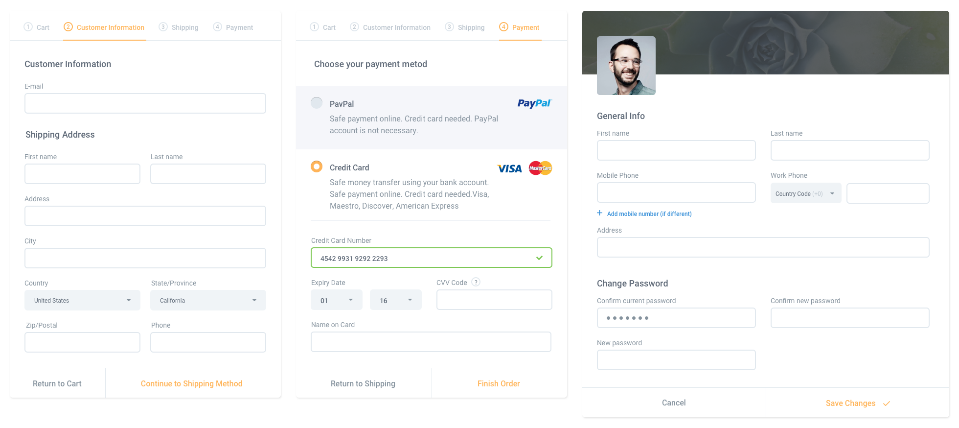
Create & Spec Components
Each module is made up of components. I created and spec'd how each component would be on mobile and desktop.

Add Content & Refine
In order to save time, we sent components before the final designs and content were complete. That way our developers already had a large portion of the coding done by the time we submitted final content.
We use InVision's liveshare and comment features to merge content and design.
Conclusion
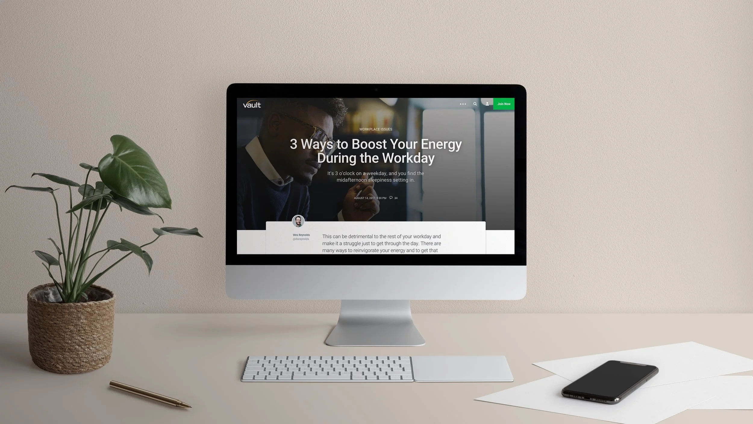
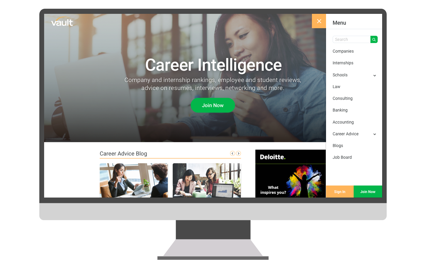
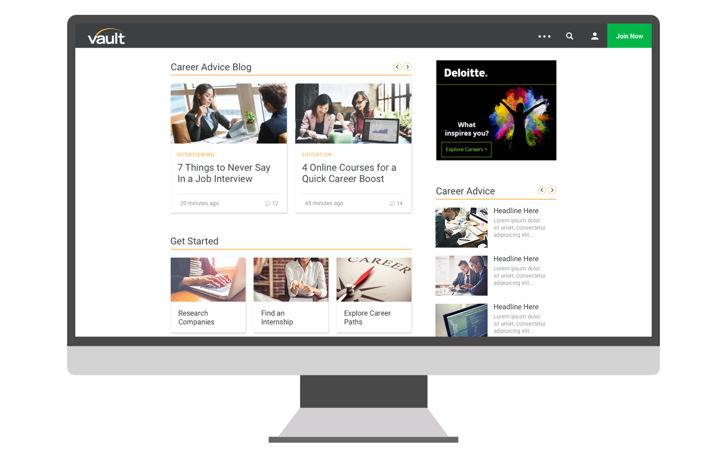
The product message and purpose are effectively communicated using a fresh modern aesthetic.
There's a clear hierarchy with type, imagery, and infographics.
Built a system that can be optimized in a sustainable way.
The design and functionality is targeting the correct demographic.
The most rewarding part about the redesign is seeing how much the performance will increase. The new foundation and modularity will allow for easy changes and adjustments. I wanted to create a hierarchy and style that anyone can follow as well as an interface that can support quick changes and testing. Creating content and imagery that work together will make the product a more usable, clear and enjoyable experience.